Tint tool
CSS Gradient Generator
Dial in a gradient, copy the CSS, ship it.
CSS
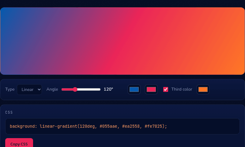
background: linear-gradient(120deg, #055aae, #ea2558, #fe7825);
How it works
This CSS gradient generator builds the linear-gradient() or radial-gradient() CSS property live as you adjust colors and angle, with the result previewed at full size above the controls. For a linear gradient, the angle works like a compass direction — 0deg points up, 90deg points right — and the colors after it are evenly spaced stops unless you add a third color, which becomes the midpoint.
When you'd use this
- Hero section and button backgrounds: dialing in a two-tone brand gradient for a landing page header or call-to-action button, then copying the finished CSS directly into a stylesheet.
- Fixing a muddy-looking gradient: adding a third color as a midpoint when a two-color gradient between distant hues is coming out grey and washed-out in the middle.
- Matching an existing brand palette: plugging in exact brand hex codes to preview how they blend together before committing the gradient to a design file or codebase.
Frequently asked questions
How do I add a CSS gradient to a background?
Copy the generated line — e.g. background: linear-gradient(120deg, #055aae, #ea2558); — into your element's CSS rules. Gradients are treated as background images, so they can layer with other backgrounds.
What do the degrees mean in linear-gradient?
The direction the gradient travels: 0deg goes bottom-to-top, 90deg left-to-right, 180deg top-to-bottom. Diagonals like 45deg or 120deg are common for hero backgrounds.
Why does my gradient look muddy in the middle?
Interpolating between distant hues passes through desaturated middle values. Add a saturated third color as a midpoint, or pick two colors closer on the wheel.
Can I use gradients on text?
Yes — apply the gradient as background, then add -webkit-background-clip: text and color: transparent. The gradient shows through the letterforms. All modern browsers support it.
From the blog
Related tools