
Color Shades, Tints, and Tones: What's Actually the Difference
A tint percentage is calculated per RGB channel as new value = current + ((255 − current) × tint factor); a shade percentage is new value = current × shade factor. A 10% tint of Rebecca Purple's red channel (102) works out to 102 + ((255 − 102) × 0.1) ≈ 117; a 10% shade of that same channel is 102 × 0.9 ≈ 92. Run the same formula on all three RGB channels and you get the full color.
In everyday conversation, 'shade' covers pretty much any variation of a color. In actual color theory — and in the design systems built on it — shade, tint, and tone are three different, precise operations, each mixing your base color with something specific. Knowing which is which matters the moment you're building a UI color scale that needs to stay consistent across ten or twelve steps. Here's the real distinction, and why most 'shade generators,' including ours, actually produce all three.
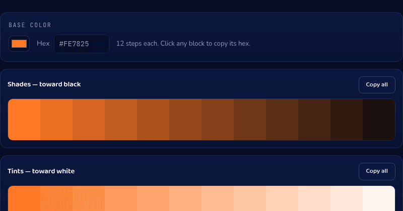
The three operations, precisely
A shade is your base color mixed with black — it gets darker while staying the same hue. A tint is the opposite: your base color mixed with white, getting lighter. A tone is your base color mixed with gray, which desaturates it without necessarily changing how light or dark it is. Three different mixes, three different visual results, all starting from the same base hue.
The confusion comes from casual usage, where 'a darker shade of blue' correctly describes a shade, but 'what shade of blue is that' often really means 'what tint, tone, or exact hue.' In design tooling, precision matters more than in conversation.
Why interfaces need the whole ramp
A single brand color is never enough to build an interface. You need a lighter version for hover states and disabled backgrounds, a darker version for text on light backgrounds and pressed states, and everything in between for borders, secondary buttons, and subtle backgrounds. A full 12-step ramp — running from a near-white tint down to a near-black shade — gives a design system every step it'll actually need without anyone eyeballing a new color for each new component.
This is also why generated ramps use a consistent mathematical step between values rather than 'a few darker versions we liked' — consistency in the increments is what makes the scale predictable to reuse across dozens of components later.
Common mistakes when building a ramp by hand
The most common one is adjusting only lightness in HSL and ignoring saturation — pure lightness shifts can make midtones look flat or muddy compared to the vividness of the base color. A second common mistake is generating too few steps, then having designers hand-pick one-off colors later that don't sit cleanly on the scale, quietly breaking the system's consistency over time.
Building the ramp algorithmically from one base color avoids both problems and keeps every step traceable back to a single source of truth.
Generate a full ramp
Our Color Shades tool takes one hex color and generates a full 12-step ramp of shades, tints, and tones, with the hex code for every step ready to copy. It runs entirely in your browser.