
Color Palette Generator: Building a Full Palette from One Hex Code
Most strong color palettes use three to six colors: one dominant color, one or two neutrals for backgrounds and text, and one accent reserved for buttons and highlights. Six is the practical ceiling for most interfaces — beyond that, colors start competing with each other instead of signaling different things.
You have one color — a brand orange, a favorite blue — and you need that whole scheme built around it: backgrounds, accents, text tints, hover states. A color palette generator produces it with surprisingly simple math, and once you understand the recipes, the results stop feeling like magic and start feeling like choices you can direct.
Step one: leave hex behind
Hex codes like #FE7825 describe amounts of red, green, and blue light — perfect for screens, terrible for reasoning. Quick: what's a slightly darker, slightly softer version of #FE7825? In RGB you're guessing at three interacting channels.
Convert to HSL and a color becomes three intuitive dials. Hue is the position on the color wheel, 0–360° (red at 0, green at 120, blue at 240). Saturation is intensity, from grey at 0% to vivid at 100%. Lightness runs from black at 0% to white at 100%. "Slightly darker and softer" becomes: drop L a bit, drop S a bit. Every palette formula is a recipe for turning these dials, and our Color Converter flips any color between hex, RGB, and HSL instantly.
The single-hue recipes: shades, tints, tones
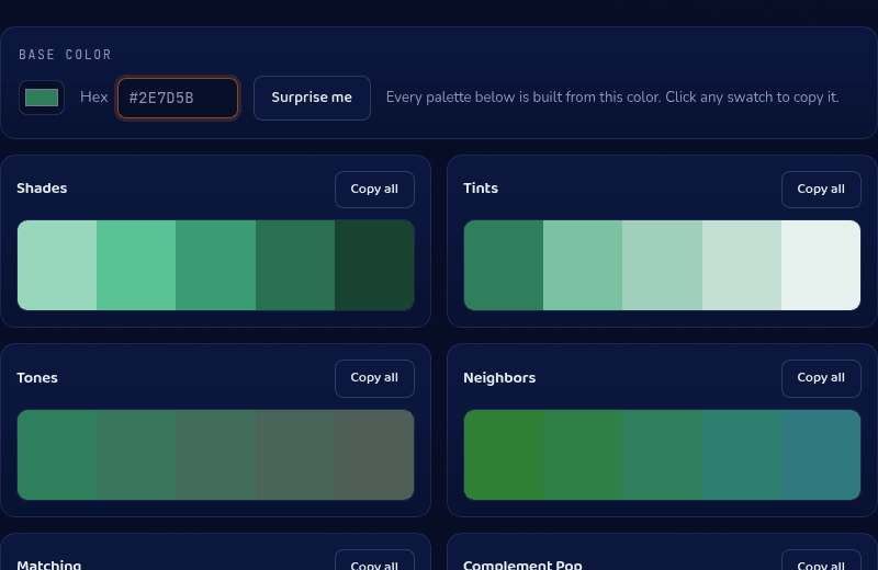
The simplest palettes never leave your hue. Shades step lightness down toward black — your dark-mode surfaces and text colors. Tints step lightness up toward white — backgrounds, hover fills, subtle badges. Tones pull saturation down toward grey at constant lightness — the muted, sophisticated variants. Design systems formalize this as the 50–900 scale you see in every component library: one hue, nine to twelve lightness steps.
If this family is what you need, the dedicated Color Shades tool stretches any color into 12-step ramps in all three directions with click-to-copy hexes.
The wheel-geometry recipes
Everything else rotates hue. Analogous (or neighbor) palettes rotate by small angles — ±15°, ±30° — producing schemes that feel harmonious because the colors are literally adjacent. Complementary jumps 180° across the wheel for maximum hue contrast: the accent that pops against your base. Split-complementary softens that by taking 150° and 210° instead — contrast without the head-on collision. Triadic rotates 120° twice for three evenly spaced hues; square rotates 90° three times for four. The wider the rotation, the more energy and the more discipline the palette demands.
Mood recipes then adjust the other dials on top of any geometry: pastel palettes push lightness high (80%+) and saturation down; dusty palettes desaturate at mid lightness; deep palettes drop lightness to the 20s while keeping saturation up.
From palette to product: the 60-30-10 rule
A generated palette is ingredients, not a meal. The classic proportion rule makes it usable: roughly 60% of your interface in a neutral or near-neutral (usually a tint or deep shade of your base), 30% in your base color's family, 10% in the accent (your complement or triad pick). Buttons, links, and highlights live in the 10%; that scarcity is what makes them read as important.
Two checks before shipping. First, contrast: run every text-on-background pair through our Contrast Checker — brand-color-on-white failures are the most common accessibility bug on the web. Second, semantic collisions: if your palette generates a red-adjacent hue, remember users read red as errors and green as success regardless of your brand story.
Choosing the base color itself
The formulas amplify whatever you feed them, so the base color deserves a decision. Warm hues (reds through yellows, roughly 0–60°) read energetic and consumer-facing; cools (greens through blues, 90–270°) read calm and trustworthy, which is why finance and healthcare cluster there. Mid-saturation bases (55–80%) generate the most usable palettes — from a fully saturated base, half the formulas return colors too loud for interfaces, and from a near-grey base, rotations barely register.
If you're starting from nothing, steal from the world: photograph something whose colors you love and pull one hex from it, or press Surprise Me until something sparks, then let the sixteen formulas do the expansion work.
Where the math ends
Formulas guarantee relationships, not taste. Two geometrically perfect colors can still clash in context, and HSL's lightness dial doesn't match human perception — pure yellow at 50% lightness looks far brighter than pure blue at 50%, which is why formula-generated palettes sometimes have one member that feels "off." Professional palettes usually start from math and end with manual nudges: shift a hue a few degrees, pull a lightness step, retest contrast.
Treat generated palettes as strong first drafts. Our Color Palette tool runs sixteen formulas on your color at once — Shades, Tints, Tones, Neighbors, Complement Pop, Split Ends, Triad, Square Dance, Dusty, Pastel Friends, Deep Sea, Grey Friends, Highlight, Hue Walk, and Gradient Stops — deterministically, so your brand color always yields the same wall of options. Pick the five that work, nudge, ship.